
Chinese Theatre Circle Rebranding Project
Established in 1981, the Chinese Theatre Circle has since been an organization that promotes Chinese Opera in Singapore.
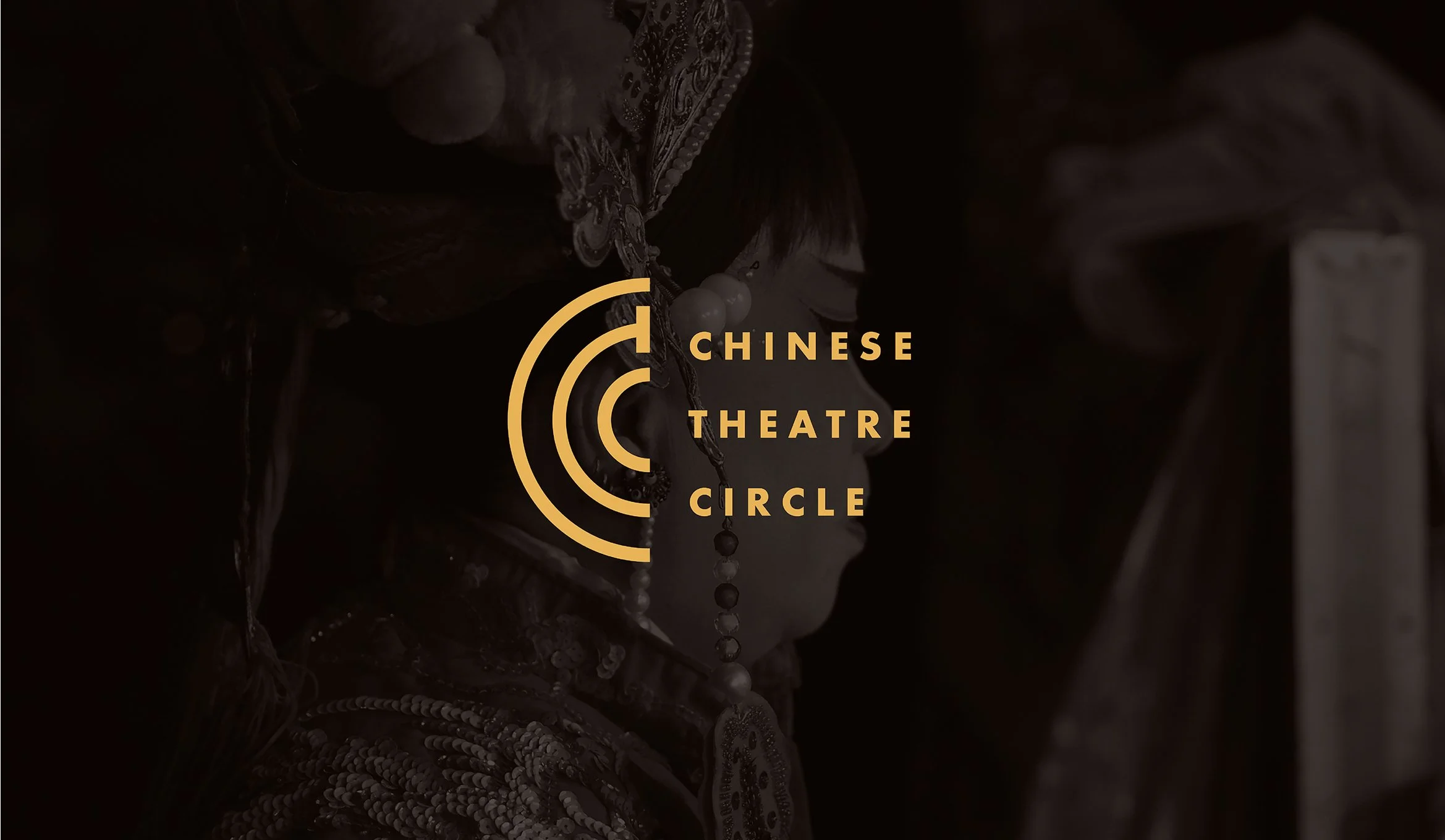
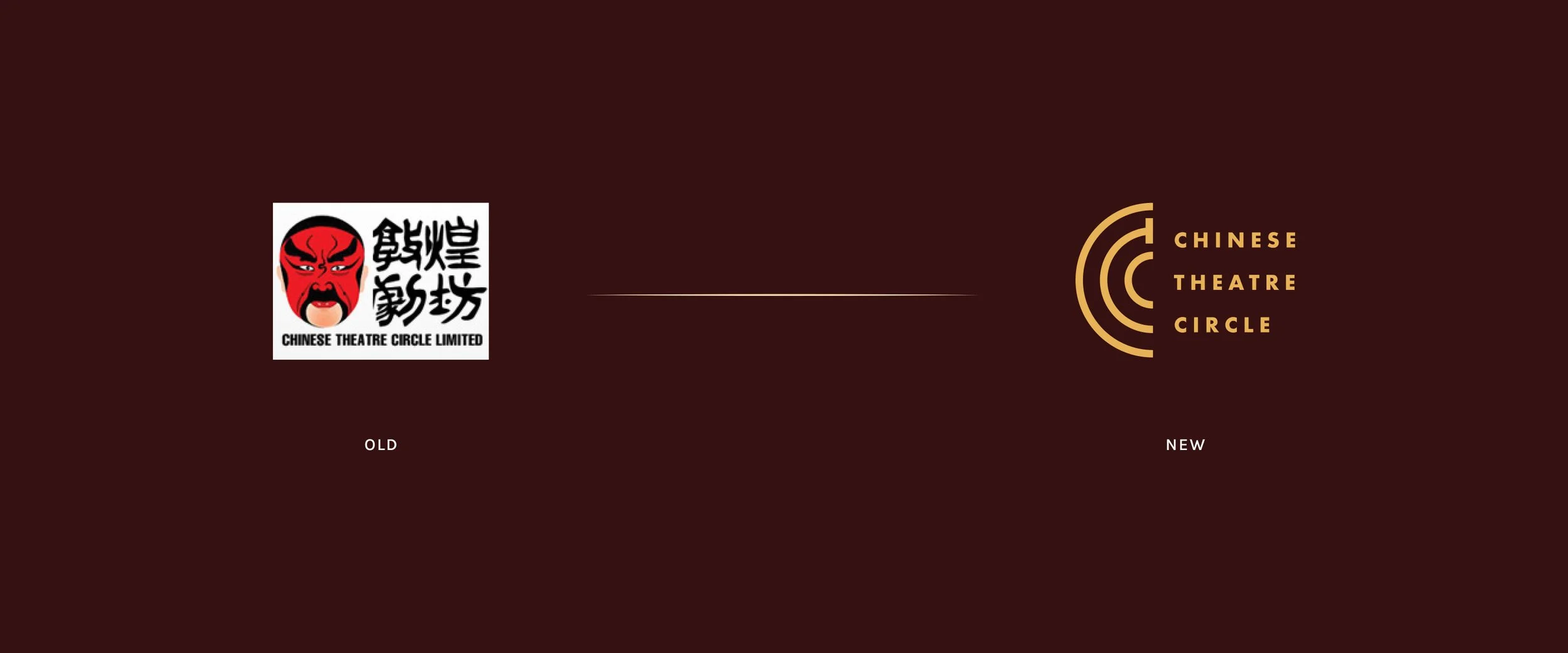
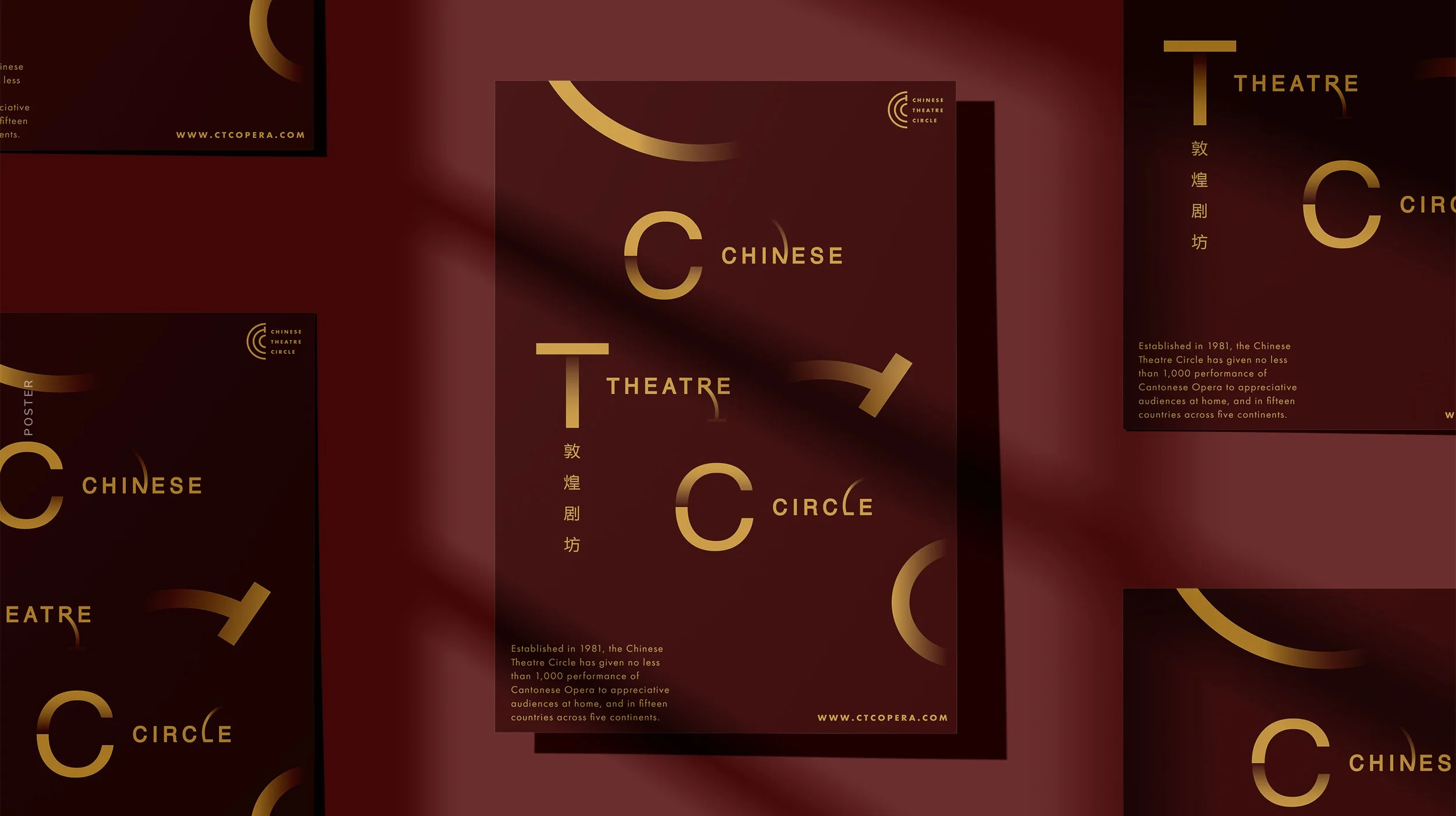
For this rebranding project, it is proceeded with a modern approach in contrast to the traditional, creating the brand's logo through the use of typography with the initials 'CTC'.
Area of focus
The main focus was to rebrand Chinese Theatre Circle by moving from its older, traditional look to a new, updated identity. The goal was to give the brand a modern feel while keeping its cultural roots intact, making it more relevant and appealing to today’s audience.
Solution
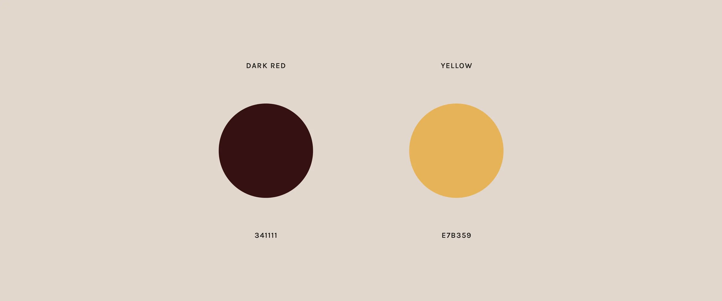
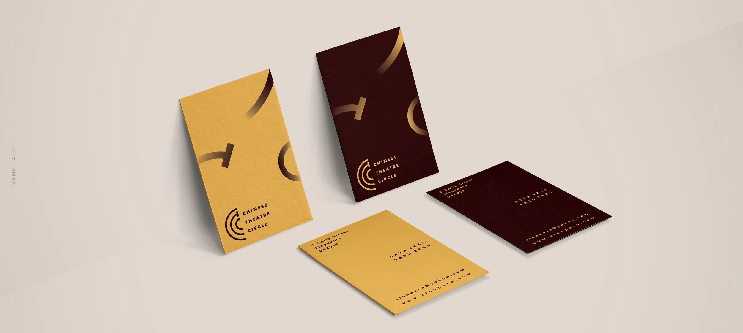
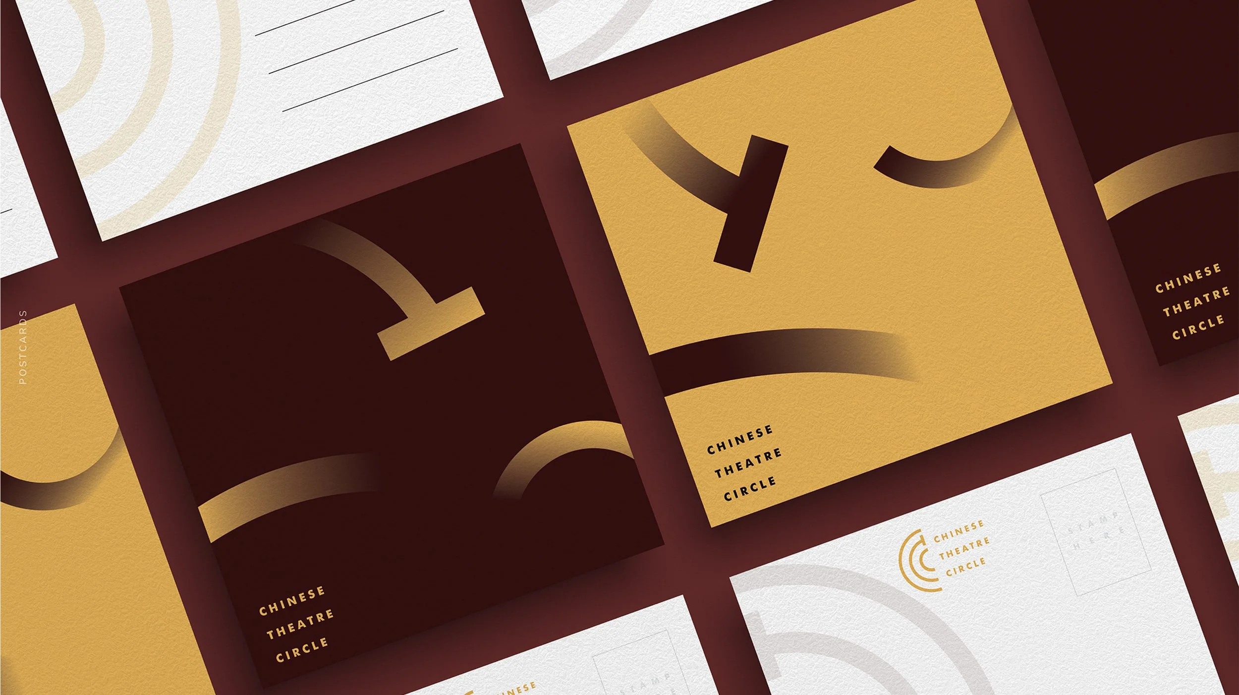
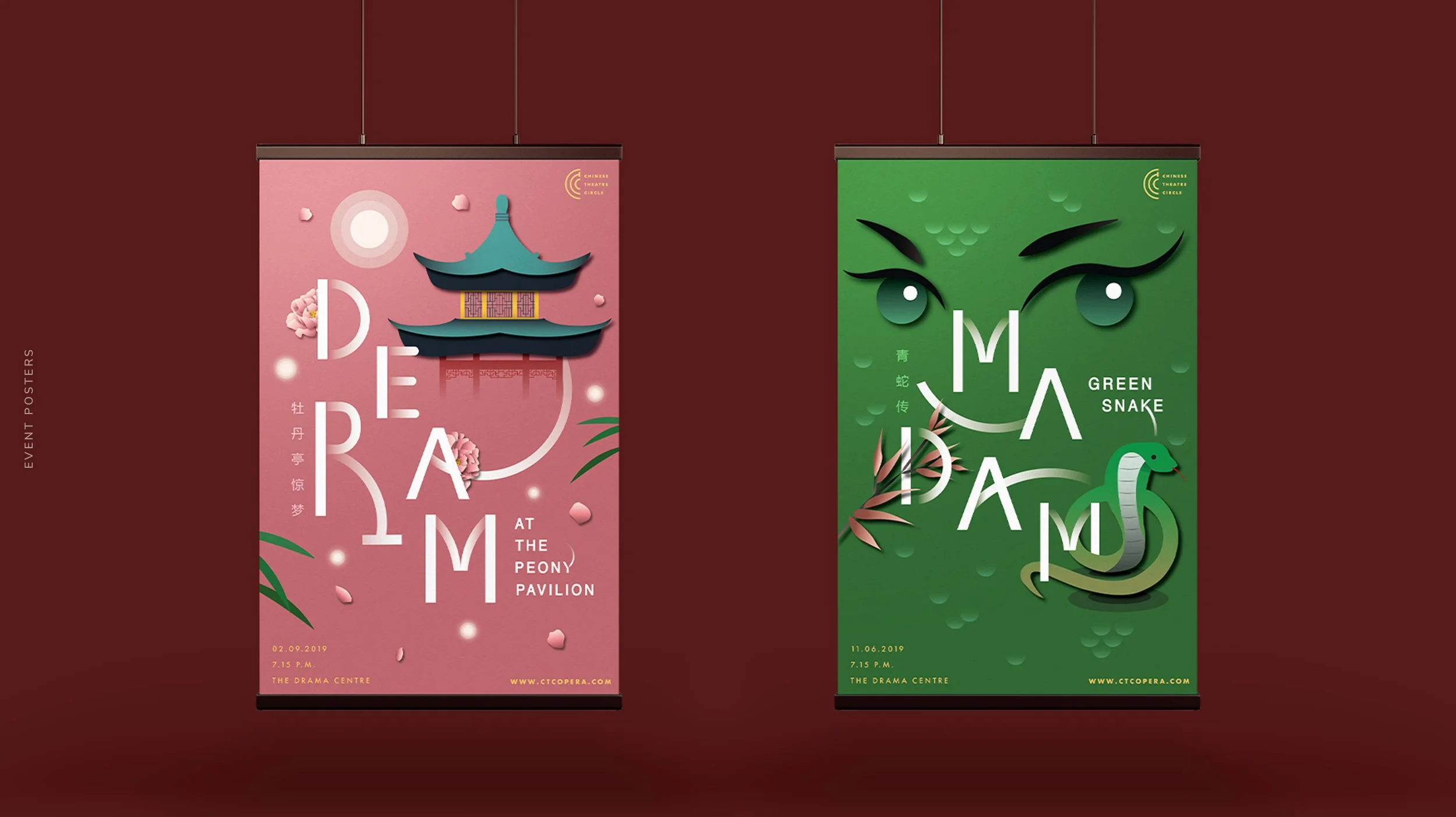
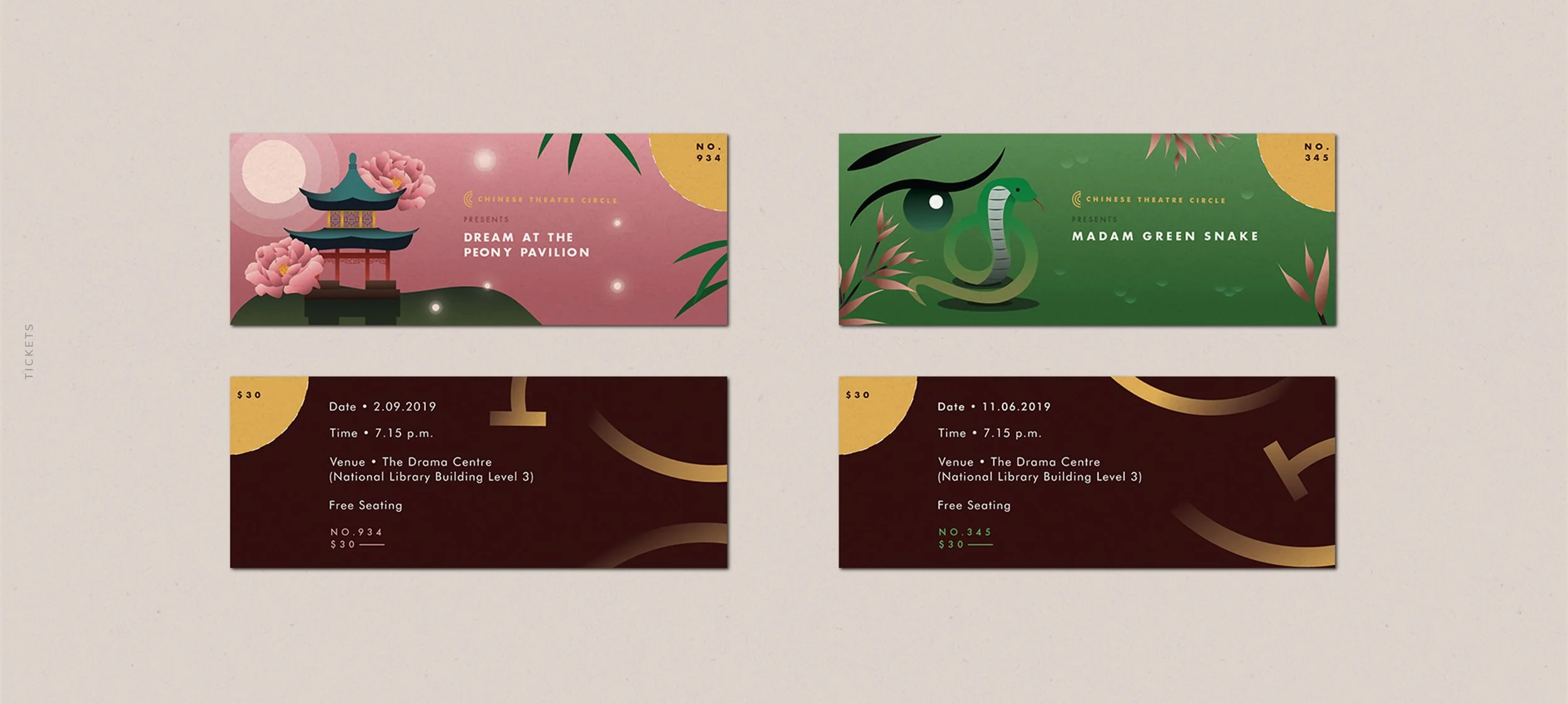
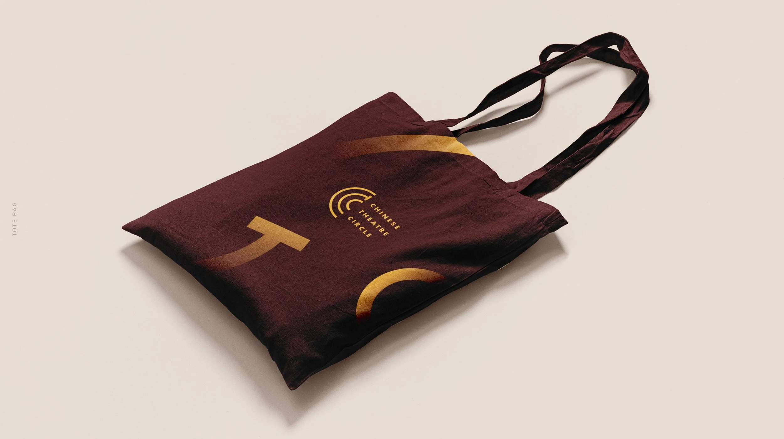
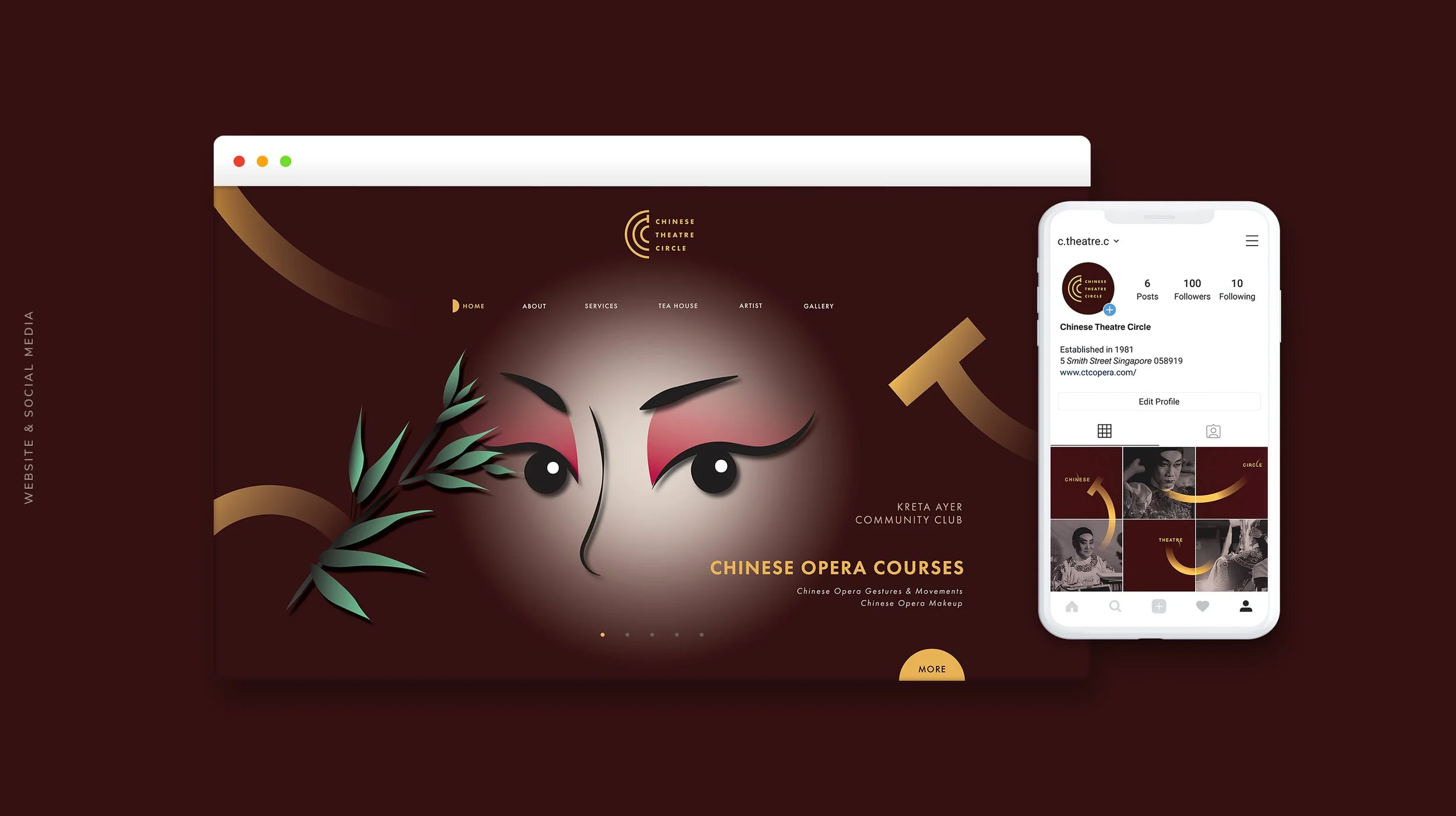
The rebrand gives Chinese Theatre Circle a new, modern identity while still respecting its cultural roots. The design moves away from the traditional style and uses a clean, bold logo based on the initials “CTC.” The circular form of the initials represents both the graceful, curved movements of Chinese opera performers and the rounded seating layout often seen in traditional theatres. A maroon and gold colour scheme was chosen to reflect tradition, while simple shapes and modern type give the brand a refreshed and polished look. Curved design elements throughout the visuals echo the rhythm and flow of Chinese opera, helping the brand feel both classic and current.


School Project
2020
ROLE — Designer
SCOPE — Branding | Print | Typography